DAVID BIANCULLI

Founder / Editor

ERIC GOULD

Associate Editor

LINDA DONOVAN

Assistant Editor

Contributors

ALEX STRACHAN

MIKE HUGHES

KIM AKASS

MONIQUE NAZARETH

ROGER CATLIN

GARY EDGERTON

TOM BRINKMOELLER

GERALD JORDAN

NOEL HOLSTON


Look At the (SUB)Way TV is Making You (FORD) Focus on Internal Ads
January 30, 2011  | By David Bianculli
 
American-idol-AD-ford-focus.jpg

Your move: You don't want to watch ads on broadcast TV shows, so you record the shows to watch later, and zip through the commercials. Network countermove: Inject more giant type and bold graphics into the ads, so you can read (and get) the message even as you fast-forward. But now, the networks have gotten even more insidious, and are stuffing ads where you CAN'T miss them: in the programs.

Product placement is as old as television, of course. But the lengths to which the networks are sinking -- well, come to think of it, those are as old as television, too. Take two very recent, very repugnant examples...

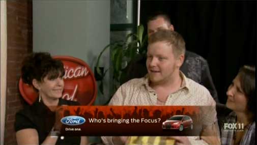
On American Idol last Thursday, Fox slapped a horizontal banner ad right on top of the program itself -- a big, inescapable, intrusive promo for the Ford Focus, showing the Ford logo, a picture of the automobile itself, and the slogan, "Who's bringing the focus?"
american_idol_ford.jpg

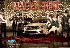
For years, American Idol has featured contestants in Ford "music videos," which is a horrible enough bit of internal advertising. But this is something new: just slapping ad copy on top of the program image itself, like a "Fragile" stamp on a package.

In the case of the Ford Focus internal ad, it ran for 10 full seconds, on top of shots of the American Idol judging panel, and winners being congratulated by friends and family.

Annoying network promos have been occupying this space, even in animated and active space, for a while now -- but to use part of the screen as a flat-out ad, that's fairly new. On a program as popular as American Idol, I'm pretty sure it's unprecedented.

And where Idol goes, idle TV executives are sure to follow. About now, I'm guessing a few people in Hollywood are second-guessing their eagerness to embrace the old High-Definition thing. Better to have kept TV at the old square proportions, and used the expanded left and right sides to place rotating, inescapable ads.

(I'm being sarcastic. But I guarantee you, someone on Madison Avenue, some modern-day Don Draper is reading this and going, "Damn...")

Also blatant, and even more insulting, are the product-placement internal ads for Subway sandwiches on NBC's Chuck. It's hard to say what's worse: the presence of the blatant plugs, or the lazily unimaginative way in which they're written and inserted.

Consider the following photo montage an overall Exhibit B. (Exhibit A? The aforementioned Ford ad. Focus, people.)
Chuck-subway-1.jpg

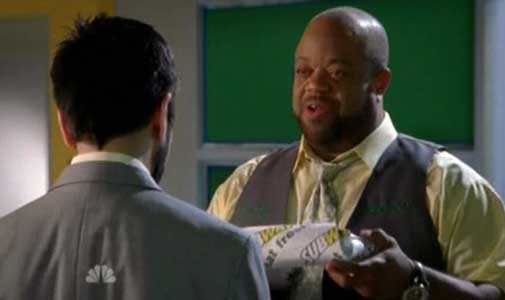
In one scene, the boss at Buy More, the stereo and appliance store seen on Chuck, offers an employee a reward for services rendered. The reward? A Subway sandwich, wrapped and ready.
Chuck-subway-2.jpg

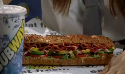
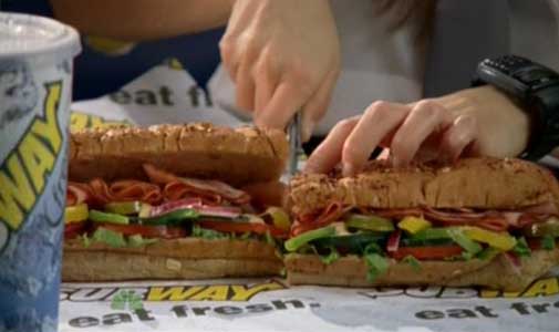
In another episode, starring guest star Summer Glau (now of NBC's The Cape), she plays a spy assassin going undercover as a Buy More employee. On her lunch break, she unwraps and spreads out her meal, shot in loving close-up -- down to and including the soft drink in the Subway cup, its label turned towards the camera just so.

Chuck-subway-4.jpg

And that's only the start of it. Next she takes out a fierce-looking switchblade and...
Chuck-subway-3.jpg

Cuts the sub in half. Which means lots more screen time -- but it's not Summer time. It's more time for the sub.

subway-4-no-buymore-employe.jpg

Finally, two other Buy More employees, staring at her through the door window of the break room, are heard voicing their suspicions that the woman is a spy. Not because she wields a switchblade at work, but because of the exotic meats and garnishes she selected for her made-to-order sandwich. "No Buy More employee," one tells the other, "is that sophisticated."

And no NBC viewer is that stupid. Although, considering the level of most NBC programming these days, that may be wishful thinking.

When TV began in the late 1940s and early 1950s, it was such a novelty that viewers didn't object to the model of radio sponsorship being transferred to television. Sponsors financed and controlled entire programs, which usually featured their corporate names right in the titles. Kraft Television Theatre. Camel News Caravan. Texaco Star Theater.
georgeb.jpg

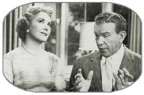
And even when the titles didn't include the sponsor's name or product, there was no mistaking who sponsored which program. Maxwell House coffee was served at every meal on Mama. Carnation Evaporated Milk soaked up so much air time on The George Burns and Gracie Allen Show, CBS threatened to pull the show unless the in-show ads were cut back.

Eventually, sole sponsorship ended and magazine-style spot advertising -- still the general current model -- began.

For about half a century, that's been good enough for broadcast TV. But now, as audiences dwindle along with their attention spans, other, more drastic moves are being put into play.

American Idol is only the start. Just as network IDs -- those ubiquitous lower-right-corner graphics called "bugs" -- have spread their way to apathetic acceptance, and similar graphics now promote other shows coming up on the network, lower-third ads are bound to grow, in use if not in popularity.

Similarly, over on NBC, Chuck is featuring admiringly photographed on-air sandwiches -- food porn -- to explode the current model of what constitutes a successful TV ad. It's product placement as media metaphor: a sub that aims to torpedo the TV status quo.

Commercials interrupting, rather than overlapping, programs? Ah, it seems, those were the good old days.


9 Comments


Neil said:

Not just that Subway sandwich so lovingly positioned in the shot, but the liner paper underneath the sandwich, so perfectly positioned to show the logo just in front of the sandwich. (And unlike every sub I've ever unwrapped, not one visible wrinkle on the paper, much less a mustard smudge or pickle juice on it, or mayo oozing out of the sandwich. A work of art. Who'd want to ruin it by actually taking a bite?)

More than that, though, what caught my attention was the "green screen" on the prop TVs on the wall behind the actors in the first still of your sequence above. This, I'm guessing, allows customized images to be added over the actors' shoulders in post production, and lets the network sell and insert different in-program ads, or in-house promos, on those TVs for the original airing, and then update them with different content before any reruns. (Similar to seeing the green screen on the wall behind home plate in the World Series when they're airing a replay, and then, a second later, in the next live shot there's a banner ad in that same location. Jarring, if you're paying attention.)

Commercial TV just refuses to make the connection between the massive - and continually increasing - clutter on their product, and the creeping disintegration of their audience numbers. While I don't have the data handy, I'd bet somewhere (probably in Audience Research at the various networks) there's a graph showing how the audience has eroded as more and more seconds of non-program material aired. And yet they never get the message, or if they do, nobody's willing to actually be the first to act on it and de-clutter the product.

I can remember when watching a first-run TV show like The Dick Van Dyke Show involved three one-minute commercial breaks in a half hour program, plus some number of seconds for the local affiliates to air their spots at the end of the half hour. Less than four minutes on a prime-time half hour, eight or less per hour. And how it was a big deal when the networks added a fourth minute per half hour to their inventory. What's it now, ten per half-hour, twenty per hour? (When you include itty-bitty credits at the end of each show with a promo taking up 2/3rds of the screen, plus all the little drop-ins and lower-third-of-the-screen promos during a show, I'll bet it's damn close to that.) That is, for anyone who's math-challenged, one minute out of every three going to non-program content.

Any wonder why the audience is leaving?

[When you put it that way -- no. Good comment! Thanks. -- DB]

Comment posted on January 30, 2011 3:22 PM


Rich said:

I will admit seeing Summer Glau with that giant black forest smoked ham foot long sandwich (made fresh to order at participating Subways!) made me like like her character more. Tiny girl - Giant sandwich.

This is 'kitten play' as MANY products & Brand logos are featured in Japanese Anime - albeit altered by one letter.

I will admit NBC's Green week was a bit over-done. Especially on "Heroes" with that tiny box eco-car that Hiro drove. The name & brand escape me....YET, I know the name of a Guest Characters sandwich??....Hmmmmm,

[Hmmmm indeed, Rich. May say as much about you as it does about the state of TV product placement. Or, at least (sigh), that it works all too well. -- DB]

Comment posted on January 30, 2011 3:39 PM


Mac said:

Said before, but worth bringing into this conversation. "Men of a Certain Age" has a Chevy dealership that is a major locale in the show, much as Archie Bunker's chair or the WJM newsroom. Love the show, love the stories the showroom generates, hate Chevy. Not for free, not for $100,000, will I ever own a domestic-made car and the troubles they caused in the past (Hondas & Toyotas are probably more US as any GM product anyway - but that's a union isue and a topic for another day). And I noticed now Brenda's phone stopped with that annoying ringtone on "The Closer" once Verizon (I think, 'cause no such phone will ever be in my life) pulled out. Part of the problem will be watching these shows in the future with all of that annoying commercial stuff in them. The only show that seemed to get away with product placement was Jack Benny, largely because the writers made a joke out of it.

Comment posted on January 30, 2011 7:49 PM


Diane Werts said:

But those George Burns and Gracie Allen in-show Carnation ads seem so cool today! It's fun just watching how tortured the scripts have to get to shovel them in. Same with the Sanka salutes on The Goldbergs. I would much rather have characters just blab about the sponsor openly than suffer through all this we're-fooling-you-and-you'll-never-notice-it stuff that airs today. It's condescending to viewers. At least the old-time stuff was perfunctory and obvious -- and because of that, often charming. (Can't beat the Flintstones smoking Winstons in cartoon ads, either!)

[Not until Fred's x-rays showed all that black ink in his lungs. -- DB]

Comment posted on January 30, 2011 8:18 PM


Linda said:

Dave -- While I agree with just about everything written here by you and others, a part of me would prefer that the program just be outrageously obvious about the product placement. Like "Chuck." All those Subway references make me laugh -- especially since Subway, thanks to the show's fans, played a big part in helping the struggling show survive past season 1. Frankly, I think it's kind of funny! They know and I know what they're trying to do so don't try to hide it. I'd rather they do that than show me two characters assuring one another that "Sure. We can fit all the stolen goods in this Ford Subdivision (thanks to Dave Barry for that particular car name). It's got seats that can be moved out of the way, enough cargo room to fit another small car and gets 75 miles to the gallon." Are you kidding me?! Just show me what they're driving and maybe I'll be interested. Or, take a cue from David E. Kelley and just have the characters say, "Sure. We can fit all the stolen goods in this Ford Subdivision. I'd tell you more but that would slow down the plot so just go to the Ford website for more information." I think the folks at "Chuck" are doing the sandwich equivalent of that. I think you know what I'm getting at. All savvy TV watchers know what's going on so just admit it, hit us over the head and move along.

[I almost agree -- the subs in Chuck still bother me, but the product placement they do on 30 Rock, making fun of it outrageously and explicitly, makes me laugh. So maybe, in these extremes, it's a matter of personal taste. Just like what kind of sub you order... -DB]

Comment posted on January 31, 2011 12:22 PM


Davey said:

It might be a good thing in the long run that the networks are making it so perfectly clear that they are run with no integrity, that the "news" and "entertainment" they present is simply window dressing for selling junk.

Junk shows like American Idol were the logical choice for finally facing up to the marketing sleaze that no controls our so-called communications system. Maybe when the present broadcast/cable regime kills itself off with its greed we can hope for something more worthy of a civilized society.

Comment posted on January 31, 2011 1:25 PM


Eileen said:

Forget commercial tv!! Does anyone remember when cable tv first originated? Why did we subscribe? Right...no commercials. I counted the number of commercial interruptions on Bravo the other night and was truly shocked. More than the regular network shows. How did this happen?

As a professor and historian, David, please help here. Was it overnight, or were commercials just gently eased into cable shows. It makes me continually wonder what I'm paying $80+ per month for.

And I'm all with Diane on the "good old days". There was a certain charm about how it was done. If Molly Goldberg liked Sanka, that's good enough for me. And George & Gracie could do no wrong, so we'll just leave it at that.

Comment posted on January 31, 2011 8:10 PM


candace said:

I actually find the Subway promos in Chuck amusing. There's no subtlety there, that's for sure. Would certainly rather see that than an ad banner across a show I'm watching.

Comment posted on February 1, 2011 2:25 PM


Margaret said:

Holy Cow David--you nailed it! On the last episode of 30 Rock (Feb 3), Kenneth's idea of putting a black bar on the bottom of the screen to block out offensive material such as "nudity and soccer" was then added to by the head honcho of Kabletown who exclaimed something like "And we can sell ads to put on it!" Yikes-- 30 Rock is always so on top of the absurdity of the entertainment business, I sincerely hope the writers were just joshing around and aren't on to something here......

As an aside, I just had to look up how similar that Kabletown logo is to another cable company we know and love.....how do the writers get away with this stuff? I am still laughing at that one.

[I agree. They're very, very Klever. -- DB]

Comment posted on February 4, 2011 3:37 PM


Leave a Comment: (No HTML, 1000 chars max)
 
 Name (required)
 
 Email (required) (will not be published)
 
LIUND
Type in the verification word shown on the image.