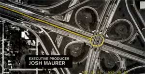
The Emmy nominations are out, and AMC's Rubicon, the one-season wonder (or blunder, depending on your point of view) got only one nomination -- for title design. It's a small, but important, nod for this cancelled little show that went way outside the lines of conventional TV storytelling. And maybe it's a fitting tribute to one of its best parts -- its tantalizing, cryptic art direction.
It's also an excuse for us to look closely, and appreciatively, at one of TV's most creative elements of all: the opening credits of quality series...

Title design gives us a quickie film -- the cinematic equivalent of an M&M -- where you get the sensibility and, sometimes, the back story of a show. And once it succeeds as a greeting card, it soon becomes a familiar, Pavlovian doorway to the world inside the shows you love each week.
Creating a good one is no small task, and the intro for Rubicon, arguably, ranks up there with the all-time greats.
The Rubicon opening (by the brilliant firm Imaginary Forces) is a slide carousel of surveillance photos marked-up in grease pencil and redacted government documents -- along with a swelling orchestration -- that put us right into the conspiratorial world of the show's fictional post-9/11 counter-intelligence agency, The American Policy Institute. Each week, we were drawn instantly into API's murky world of hidden signs and ciphers.
You can watch the opening credits of Rubicon by clicking HERE.
The good ones go way back. Perhaps the British understood it the best with the opening of The Saint, starring a very young and dashing Roger Moore. Initially syndicated to the States just after the James Bond spy craze first hit theaters, it featured a great '60s jazz-danger theme, a superimposed halo over Moore each week, and then, onto nothing more than a stick figure drawing, the logotype of the show, with that trademark halo. The suave, leading character -- Simon Templar -- couldn't have been branded, or have endured, more simply.
Same thing for the opening from Perry Mason, which ran from 1957-66 on CBS. I don't know any boomer who could not recognize a few bars of that swinging saxophone backbeat and the braying trumpets. Although it wasn't much visually -- just Mason (Raymond Burr) grinning to himself about how he was going to stick it to District Attorney Hamilton Burger (William Talman) yet again.
Since then, there have been some true, memorable greats. The '80s gave us the great Jan Hammer synth-theme for Miami Vice, accompanying the quick-cut montage that put Miami Beach on the world map as a sexy, dangerous playground. This is an example of the first-season opening credits, from the NBC series' launch in 1984:
Soon after, in 1990, ABC's Twin Peaks had fades of gushing waterfalls and bucolic scenes of the Great Northwest scenery of Washington State, coupled with an unforgettably watery, dream-like theme that was in creepy juxtaposition with David Lynch's oddball Killer Bob and the murder of Laura Palmer. The show's beautiful opening credits can be seen below -- after the not-so-beautiful but unavoidable commercial.
More recently, there was the brilliant mash-up of historical clips that began HBO's Carnivale (2003-2005), conveying a setting through old film and collages of tarot symbols. These images, presented by the Los Angeles production firm known as A52, set the table for a metaphysical war between the forces of good and evil, fought out in the depression-era Dust Bowl period.
The close-cropped mortuary scenes that opened the 2001-05 HBO series Six Feet Under (by the design firm of Digital Kitchen, and my favorite opening sequence of all) were wonderful, neutral-toned, sometimes intentionally over-exposed shots that set up the oddball world of a dysfunctional, family-run funeral home. Its tinkling, ticking clock-y theme seemed to mark off time that was running out for all of us.
And currently, we've got some great quick-cuts and black-and-white footage from the dark bayou of barflies, faith healers, civil rights marchers and boys smacking on red jam -- along with some seriously off-putting fast-motion decay -- that start off HBO's True Blood every week. (Again, another very credible mood and sensibility set-up by Digital Kitchen.) Great music, too -- Jace Everett's "Bad Things."
FX's Justified uses similarly grainy, out-of-focus shots and bad edits for a montage set-up of hillbilly noir in the back woods of Kentucky. So does HBO's Real Time with Bill Maher, which uses a black-and-white newsreel montage to whiz through 20th-century politics in under 30 seconds.
Real Time gives a sense of weekly urgency with an urbane hip-hop, pulsing theme that runs along with a time-code counter at the bottom of the screen. FX or its Fox parent corporation, oddly, has policed YouTube postings to keep its Justified opening theme video off the web, but the Maher camp has let one or two sample show openings slip through:
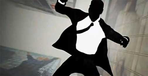
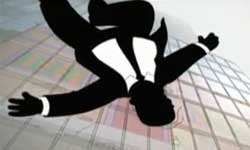
It's plain that the appeal of a show such as AMC's Mad Men is strongly linked to its styling, which is up front as a main feature of the opening credits.
Maybe the winner here -- and yet another wonderful piece by Imaginary Forces -- it brilliantly takes line drawing styles and colors from the early '60s (and, I'd argue, from the product literature of renowned 20th-century furniture maker the Herman Miller company).

Along with its drifting classical theme, the opening sets the table perfectly for Don Draper's house of cards each week. (Anyone notice that Don is always falling in this sequence? Perhaps a foreshadowing of his ultimate downfall for the series finale?) You can see it HERE. And, just for laughs, you can compare it to the equally brilliant Simpsons parody, which you can see HERE.
(The Mad Men original artwork is shown at the top of this column, the Simpsons parody at right.)
Mad Men has created such a buzz with its branding and styling that it has spawned new retro furniture lines, and at least two broadcast TV knockoffs coming this fall: ABC's Pan Am and NBC's unfortunate Playboy Club, which aspires to go no farther than giving us a Don Draper doppelganger, this time as a shadowy lawyer surrounded by Bunnies.
And finally, there's Showtime's Dexter -- one final Digital Kitchen triumph), with its blood spattered drain, creepy closeups of breakfast meat being seared, and its ironic, macabre and playful theme... all with closeups of Michael C. Hall's Dexter, the serial killer's serial killer, chewing his breakfast.
Opening titles never broke a show. But done well, they've forever branded shows in the minds of their faithful audiences. The Six Feet Under and Carnivale clips, from shows that have been off the air for six years now, still make the top ten title lists on most websites.
That's a memorable calling card, and one that has helped memorable shows endure after they're gone. No small feat for a minute of air time.
And it's probably how I'll prefer to remember the conspiracy-laden, alienated New York City of AMC's lost Rubicon.
So let's start a dialogue: What are the opening theme sequences you most remember, and consider the best? And why?