DAVID BIANCULLI

Founder / Editor

ERIC GOULD

Associate Editor

LINDA DONOVAN

Assistant Editor

Contributors

ALEX STRACHAN

MIKE HUGHES

KIM AKASS

MONIQUE NAZARETH

ROGER CATLIN

GARY EDGERTON

TOM BRINKMOELLER

GERALD JORDAN

NOEL HOLSTON


The Relaunch is Here! The Relaunch is Here!
August 22, 2010  | By David Bianculli
 
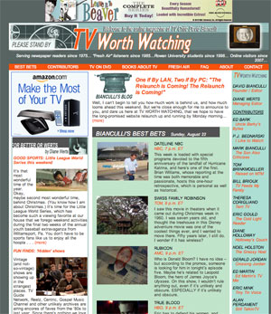
If you've been here before, you should already be able to tell, just from first glance, how different things look around here, and how hard we've worked to make "TV WORTH WATCHING: The Next Generation" an even more compelling place to visit for all things related to quality television. And if you're a new visitor, welcome. This is a place where writers and readers who care about, and seek out, excellent TV, come to congregate, debate, and find new things to watch...

The site is still in transition, but TVWW 2.0 definitely is up and running.

Rather than do a blow-by-blow, item-by-item list of all we've done, let me just, for today, point out the highest of highlights.
relaunch-pic-1.jpg

In addition to the two blogs that previously were showcased on the home page -- mine and Diane Werts' -- we now make room, at the bottom left, for the four most recent blogs by our contributing writers. Click on those stories, and read them on their own pages. Or click on the CONTRIBUTORS button on the navigation bar, and go to a collection of ALL contributors' blogs.

OR... and here's the fun part... go to the masthead on the right side of the home page, where ALL our writers are listed, along with their individual column names. Click on THOSE, and go immediately to their home pages, where every story they've written for or shared with TVWW is right there, in their own cozy space.

And what writers. Counting Diane and me, there are 15 of them -- and those of you in the industry, or who have read bylines of major newspapers over the past few decades, are likely to recognize a lot of them. Ed Bark. Diane Holloway. Noel Holston. Eric Mink. And so many more... well, just read them for yourself. The roll call, AND the columns. I couldn't be prouder of the company I'm keeping, or the website we're collectively generating.

Other new additions to the site are actual random bits of video (I held out long enough, but now it's easier), reviews of new and classic DVD releases (some with scroll-over hover text!), and -- but wait, there's more! There's also BUT WAIT! THERE'S MORE!, a collection of more fun stuff, from TV theme songs to my favorite Fresh Air reports and newspaper stories.

Please look around, and play around, and comment here to tell us what you think. I especially encourage you to read the other bloggers, and welcome them by commenting on whatever you find interesting, whether it's Ed Bark's review of Spike Lee's new HBO documentary or Tom Brinkmoeller's evisceration of NBC's upcoming Jimmy Smits drama...

And a special thanks, for their months of hard work and a Sunday of insane crash cramming, to the team that pulled this off with and for me: website designer Eric Gould (also a columnist here, as of late, and an excellent one), webmaster Rich Baniewicz, and Diane Werts, who as of today gets a much-deserved promotion, and even more work, as TVWW's managing editor.

And now, at about 10 p.m. ET Sunday, we're putting this puppy to bed. And then, shortly thereafter, ourselves...


17 Comments


Eileen said:

The new site is fantastic; I particularly like the masthead. There is so much to see & do here I'm overwhelmed!

I know what I'll be doing all day Monday. Congratulations & thanks to you & all your tech people for a job very well done.

[Much, much appreciated. Thanks, Eileen. Keep us posted, as we keep, uh, posting. -- David B.]

Comment posted on August 22, 2010 11:17 PM


Marlark said:

TVWorthWatching.com 2.0? "Worth" the wait. Great job!

[On behalf of Eric, Rich, Diane and myself, thanks. This is a mom-and-pop operation... and all the parents are whipped. But proud. -- David B.]

Comment posted on August 22, 2010 11:31 PM


Toby O'B said:

I'm liking what I see so far, especially that it looks a lot more stream-lined, not "clunky" as the previous set-up seemed to be. Only a momentary panic when I went looking for what you know is my favorite section - the Extras - but I found they'll still be around as well.

All the best for the next generation! I'll be sure to give it a special plug once I get home to Toobworld Central in the morning.....

[Thanks, Toby. You're one of the champs who has supported us from Day 1. And now, almost three years later, it's finally Day 2! -- David B.]

Comment posted on August 23, 2010 12:29 AM


Gregg B said:

I love the new design as I have always loved the content. It's great that the columnists now have separate blogs and I am excited that Diane W has a larger role. I'm glad you included links to some of my favorite outside TV bloggers such as Jaime Weinman. One stop shopping for my TV fix. Keep up the good work David and team!
[Thanks! We'll try. Or drop trying. -- David B.]

Comment posted on August 23, 2010 9:02 AM


Jasmine said:

This looks great!

But I also wanted to prove to you that sometimes your students continue to read your blog, even when they're actually no longer your students! Keep up the awesome work!

[Awww, thanks, Jasmine! Good luck out there. -- Prof. B]

Comment posted on August 23, 2010 9:06 AM


Phillip R. Crabb said:

Great Stuff Dave!

I was looking forward to this like I used to anticipate TV Guide's Fall Preview editions back in the 60's, and just like them, there's so much to see and do...

Best of luck as always, you've raised the bar with the site.

Phil
Franklin (Sussex County) New Jersey

[What a terrific compliment. I used to LIVE for TV Guide's annual fall preview issues. And so, by the way, did Randy Newman. He told me so, when I interviewed him once and we got off track. -- David B.]

Comment posted on August 23, 2010 11:11 AM


Joanne L said:

Like the new site. Big improvement. One suggestion - add a "Home" page link.

[On any page, just click on the main banner, and it should take you back home. -- Or so I'm told. -- David B.]

Comment posted on August 23, 2010 11:16 AM


PHD said:

Great redesign...been a fan since the daily news and will continue!

Best of luck!

[Thanks! We need you here, or it's no fun. And has no point. -- David B.]

Comment posted on August 23, 2010 11:18 AM


Cathy said:

Nicely done! Much appreciated is that you listened to feedback from waaaay back - namely that blinky, flashy open-up-in-your-face ads would be a negative. Great job Mr. Bianculli.
[Thanks -- but on this one, Rich, Eric and Diane deserve even more credit than I. Of the four of us, I'm the one who understands this stuff the least. I just say "Wouldn't it be neat if...," and a year later, here it is! And I'm not complaining, because while we're all multi-tasking on other stuff, it TAKES a year. We put in a collective 40 hours of work just yesterday... and I hope it shows. -- David B.]

Comment posted on August 23, 2010 11:32 AM


Alex F. said:

Gah! Change! Dramatic change! I can't deal with this!

More seriously--it's going to take some getting used to, but so glad to see the site growing and evolving!
[I know what you mean. I still prefer my Coke in tiny glass bottles. -- David B.]

Comment posted on August 23, 2010 12:13 PM


Chris C said:

Well done! I like the new design. Bravo. :)
[Thanks. And now that THAT's done, maybe I can get winning prize off to you in the mail soon. I'm unreliable, but not forgetful. -- David B.]

Comment posted on August 23, 2010 12:19 PM


Gov G said:

I like the new design and your web site has been part of my daily reads for some time now. I wish you would also add an rss feed for at least the "best bets".

Thanks,
G

[We have one for my blog, I think -- but now I'll put the Best Bets on the list. We're also hoping to make that searchable, and to have me get a day ahead. We'll see. -- David B.]

Comment posted on August 23, 2010 12:26 PM


David J said:

Great new look. Easy (nay, easier!) to find everything, and all the content I've come to know and love is still here.

Great job!
[Thanks! Honestly! Eric gets most the design kudos. But in his absence, I'll accept them. -- David B.]

Comment posted on August 23, 2010 1:45 PM


Jake said:

I want to start by saying content-wise you got it here. This is quickly becoming one of the best sites for TV information and reviews. I've been coming here from its launch as I've followed you from your Daily News column, but with all due respect there are afew elements of the redesign I'm not a big fan of. The homepage seems a bit busy to me. The homepage kinda seems like information overload. The content is here without question - the problem I see is a better way to offer it on the homepage as a look into whats available inside. For example maybe for the blogs just the title of the posting and the author. I think your blog should get more room at the top and the New This Week and Video Worth Watching should either be on the side or farther down on the bottom. As I said you have the top quality content, now its just a matter of finding a way to better display the content. I think its a big improvement from 1.0 and you certainly have grown the site from a one man show to a big operation. I dont mean to be critical. I really do like the site - I check in everyday so see what to watch and read all the columns - I'm just trying to offer my 2 cents. Keep up the good work.

[Your two cents are always welcome, and as someone who's been here for years, you certainly have earned the right to criticize. Besides, that's what this site is all about, really -- criticism - so I'd better be able to take it as well as dish it out. We'll live with the current layout for while, and ask you to do the same... then take its temperature, collectively, once we get through next month's fall TV launch. And thanks for the kudos about the content, which is what REALLY matters. Except to Eric, our designer... -- David B.]

Comment posted on August 23, 2010 10:14 PM


Angela said:

Got a question. If I click through here and go to Amazon, but I don't buy what I clicked on here, instead I buy something else on Amazon, will your site still get the contribution?

And this is an idea. I know you asked for them way back when. :P But recently I read that it's easier on the eyes if the background is more of a really light, pale, yellow. I'm beginning to think it's true. I doubt anyone would even notice the color difference, but our old eyes might. Just a thought.......And I'm sure one of the design gurus would know more about it than I do.

Oh! And, never mind. I'll look around more before I show my ignorance. :)

[YES YES YES! If you visit Amazon by being "directed" from TVWW, we get a tiny piece of anything you buy on that transaction. So spend away! And I'm sorry about the messages always getting bounced. I hate computers so much, I always highlight and save a message before I hit send, just in case -- so if it vanishes, I can just replace it and try, try again. Works for dating, too. - David B.]

Comment posted on August 23, 2010 11:51 PM


Angela said:

Yay! That was the first time I didn't have to re-enter my message because of an error saying text entered incorrectly. And it always happened before. Cool beans! [See my answer to your previous email...if it hasn't vanished. -- David B.]

Comment posted on August 23, 2010 11:54 PM


Sally W. said:

Just wanted to note: TWW 2.0 looks quite... refreshing! Really exciting!

And, just in time for the Emmys and fall tv (call me a traditionalist, but I'm still a sucker for a traditional fall season!). I'm already looking forward to the fall offerings on PBS' Masterpiece Mystery umbrella and maybe seeing Ken Burns' newest "inning" to his Baseball documentary; and getting more than curious to see what will happen in the acting categories for the Emmys.

Comment posted on August 25, 2010 10:02 PM


Leave a Comment: (No HTML, 1000 chars max)
 
 Name (required)
 
 Email (required) (will not be published)
 
WGWLB
Type in the verification word shown on the image.