DAVID BIANCULLI

Founder / Editor

ERIC GOULD

Associate Editor

LINDA DONOVAN

Assistant Editor

Contributors

ALEX STRACHAN

MIKE HUGHES

KIM AKASS

MONIQUE NAZARETH

ROGER CATLIN

GARY EDGERTON

TOM BRINKMOELLER

GERALD JORDAN

NOEL HOLSTON


Hell Freezes Over Again: First the Book is Finished, and Now the Website Relaunch is Nearly Here
June 25, 2010  | By David Bianculli
 

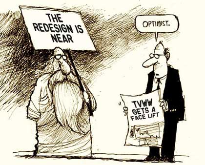
endnear2.jpgLong ago, I swore to myself (I do that a lot, especially when working with computers) that TV WORTH WATCHING would be redesigned and relaunched before we published "Guest Blog #100." Our guests, after that much time, deserve their own comfy spaces. Well, when we post our next guest contributor's column Monday, it'll be #99, so we're cutting it really, really close.

But honest, folks, the redesign is right around the corner. If you picture July being a corner. And we thought, since this is such a laborious and painful exercise anyway, we may as well expend every effort to get it right. So we're asking YOU for help...

We don't want to spoil surprises by prematurely unveiling Eric Gould's beautiful new website design. (He hates it when things go off prematurely.) But we can tell you this much:

In the new TV WORTH WATCHING, every contributor will have his or her own home blog page, just as Diane Werts and I do now. In addition to the latest posts from Diane and I, the main page will make room for the openings of the latest three or four posts from them, giving us many more voices from the start.

Best Bets, with its nightly round-up of TV choices, will continue to be the feature around which the site is built -- and we're working on making it interactive, an addition requested recently by one of you indispensable readers. Which made us think: What OTHER ideas do you have that we might be able to pull off to make the site more functional and enjoyable?

We're making it a searchable website in the new incarnation, and even adding a spot for favorite fun videos. We're adding a few other things, too, but the key thing is our writing staff. TV WORTH WATCHING, I truly believe, has the most authoritative and readable gaggle of TV critics gathered anywhere, and we're about to add even more tenured talent to the mix.

And, I believe just as truly, we have the smartest and most literate readers anywhere on the whole damn web. We're thrilled you've stuck with us since our November 2007 launch, or joined us along the way. So even though our production/edit/design team is overwhelmed already, we're taking advantage of your collective smarts by asking:

What next?


13 Comments


Betty said:

Your proposed changes sound great. I especially like the prospect of a search feature. My only suggestion is one I've sent along before -- my aging eyes find your home page slightly hard to read (the blue print on olive background). The current page (white on brown) is much better.

Comment posted on June 25, 2010 6:02 PM


Dave said:

Love your daily Best Bets, David, and looking forward to the website redesign. One suggestion -- since i leave for work early and often get home late in the evening, would it be possible to post Best Bets either the night before or early morning to aid with DVR settings? Many, many thanks for a great site and your splendid viewing recommendations and blog!
Dave
[That was my New Year's resolution -- for 2009. But it makes perfect sense, and it's a goal, and yes, I'll try to have the Best Bets posted early morning for pre-work recording settings. Especially now that I know it's worth it, at least to ONE person... Thanks. -- David B.]

Comment posted on June 25, 2010 10:01 PM


Eileen said:

I've tried to post comments on several occasions using the characters posted below, and have gotten a prompt that I couldn't post, even though I was positive I'd typed in the correct I.D. Help!!
The characters are very often a bit fuzzy, i.e., not sure if it's a lower case l or j, etc. It would be a major help if these characters were a little clearer.

It's very frustrating when you think you've composed a masterpiece, only to have it rejected!! Only kidding... This site is certainly worth the effort...

Here goes...

[I'd hato to lose a post, especially of yours. We'll look into the ID thing to see if there's a more readable substitute. Meanwhile, someone else told me that the same thing happened to him, so now, before he hits submit, he saves the text, just in case he has to dupe it on a second attempt. -- David B.]

Comment posted on June 25, 2010 10:39 PM


TJR said:

RSS feeds for the Best Bets would be a fabulous addition.

[Great idea. Whatever it means. But seriously, I'll put my team on it. And by my team, I mean Rich. Okay, Rich? -- David B.]

Comment posted on June 25, 2010 10:48 PM


Tausif Khan said:

I hope the site redesign is going well. I can not wait to see the new homes for the new guest contributors. While I admire change I hope we don't lose what works now on the blog. I really appreciate David's personal responses to the reader comments on posts. It is one of the main reasons I follow this blog as opposed to some others.

I also hope in the future that this blog also addresses the different concerns of academics and journalists in their various approaches to television and cultural criticism. I follow Jason Mittell's Just TV blog (http://justtv.wordpress.com/) and Wisconsin's Antenna Blog (http://blog.commarts.wisc.edu/) for different reasons than I do Alan Sepinwall's What's Alan Watching blog (http://www.hitfix.com/blogs/whats-alan-watching). The main difference is that with academic blogs I get the analysis of social impact and more long term illumination. For journalistic orientated television criticism I follow them because of the critical conversations which are produced weekly by following shows episode by episode. I hope both these views are represented as both journalists and academics (as I understand) will be a part of the blog. Either way this is a great blog and hope to fall it through all of its changes.

[Tausif -- Thanks so much for the detailed analysis, and the support. Rest assured, I'll keep responding personally to posts, as will the other contributors. We're all in this together, and probably wouldn't be writing without readers. (I say probably, because some writers just can't stop.) And I love your comments about academics, since I'm now one of them too -- and believe it or not, once TVWW is redesigned, I have plans for ANOTHER website, one more oriented to TV in the classroom. More on that later. Much later. But thanks. - David B.]

Comment posted on June 26, 2010 12:57 AM


Jeff B. said:

I come to your site nearly every day to check out your Best Bets section, and end up sticking around for some of the interesting columns. Thanks for asking the reader's opinion. Here are a few things I think could improve:

1-better color scheme - no more browns!
2-easy links to ALL your segments on NPR. A one-stop page would be great because I always enjoy your segments but rarely catch them on the radio.
3-I love the Best Bet's section, but I know there are some days there are more than 6 things that are best bets! Maybe a side list of a few near-misses and new show premiers.
4-Since you and the other contributors on the site are CRITICS, could you give us occasional STEER CLEAR recommendations. We often hear lots of hype on certain shows & events, so we watch them and they turn out to a be colossal waste of time. If we had your opinion, we may still watch them, but at least we would be warned!

Keep up the great work!

[Wow, Jeff, these are all great suggestions. You'll like the new color scheme, I suspect. An NPR link shouldn't be hard. I'll try to cover additional Best Bets, and Steer Clear warnings, in my daily column -- now that the guest contributors all have their own home base pages, I won't have guest columnists to occupy my space any more, so there will be more room for that sort of stuff. Nice idea. -- David B.]

Comment posted on June 26, 2010 1:19 AM


Omer said:

I love this site and enjoy reading the commentaries. I only wish Best Bets were posted at a consistent time. Your site is the first one I open at the office at 8:30 am. Sometimes Best Bets are fresh, and most times they are not. When I check later in the day, they're up before noon and sometimes as late as 5 pm. I've missed some good stuff that I would have dvr'ed if I had known. It's a petty peeve, but worth mentioning.

By the way, I loved your interview with Connie Britton. The clip about Tami and her daughter's discussion of first sex experience and the comments after were worth the entire interview. Great job!

[Thanks. I thought that clip was terrific, too. And I'm guilty as charged about the inconsistent Best Bets posting. Here it is Saturday at 10:30 ET, and I haven't even started on them. So yes, this is a clear focus for TVWW improvement, and one for which I am wholly responsible. So I'll work on it. Maybe even BEFORE the redesign, if I can. -- David B.]

Comment posted on June 26, 2010 8:04 AM


Mario Acerra said:

TIMELINESS!!
By far the most important change I would like to see is having the Best Bets available earlier in the day. Right now it is 11:30 am on Saturday and the Best Bets are for Friday. I like to plan my TV watching early so my entire life can revolve around the intended viewing experience and the anticipation it generates throughout the day. I'm not sure why you have to wait so long in the day to post. Surely the information is available to you ahead of time.
[Mario -- I get, even from the few responses thus far, that posting Best Bets earlier, on a more reliable schedule, is tops on the triage list, so thanks. I'll work on that, even before the redesign. But to answer your question directly: Why do I wait so long in the day to post? It's because, in addition to this website, I teach, I host and report for Fresh Air, I'm working on other projects, and, on occasion, I have a life. (Well, I play tennis, anyway.) So sometimes, I post the Best Bets late because I write them when I can. But I WILL, as I used to do, begin to post more efficiently. Real soon. Just maybe not tomorrow. And, he adds sheepishly, the Best Bets are up now. -- David B.]

Comment posted on June 26, 2010 11:31 AM


Marlark said:

Well, I've been holding back for about six months, still infused with the boost of caffeine from Borders, but here you go:

Mission
TVWW should be the one-stop for the TV fan that wants to immerse him/herself in the experience of quality television -- whether it's passively by watching the best TV has to offer, interactively by engaging in text or live conversation with the creative forces behind/among TV, or holistically by exploring the impact and shared community that TVWW has upon our very culture.

How can TVWW deliver on that mission? And do so while building revenue?

Best Bets
The core of TVWW. Should continue to be center stage. Needs to be posted at the same time each day. Should include a link along the bottom called "In Depth". This would go to a page that includes the text of the "Best Bets" but also includes an embedded video clip of the show (or network trailer of the episode), along with any historic TVWW review of the series or program.

Best Bets should be syndicated to other sites for embedding in their sites, as well as any personal web pages.

Best Bets should include RSS links.

Your TVWW
To further enhance the interactivity of the site, allow visitors who have registered to create their own reviews of just-aired shows in a blog fashion.

This section can also include a running "most popular" TVWW top ten. There can be multiple categories: Overall, Crime, Comedy, Family, SciFi.

Once these reach a critical mass (50 or so participants), TVWW should popularize the results with a weekly index sent out via press release (and Tweet).

Weekly Themes
To maintain freshness and keep visitors coming back, each week should have its own theme. This can be done with a swap out of color backgrounds, a header image, or a promotional banner. The theme can run the gamut of the visual entertainment industry as viewed on a TV monitor. A guest columnist can tackle the subject and a fun image can promote it.

Tops in TV
Post the top DVD rentals/purchases/downloads of the week as reported by industry announcements. Or, better yet, list only the top ones that have scored a 75% or higher on Metacritic or Rotten Tomatoes.

Classic Reviews
Reach into the David Bianculli archives and feature a blast from the past review of a beloved TV show. "SNL" of course has been seen on TVWW. What about "Law & Order", "The Sopranos", "The Wire?" A classic review associated with other content to place it within context, (assuming permission exists) such as interviews, photos, and commentary about its impact on culture. Guests can write this.

Promote Tweets
Include a module on the home page that carries the latest TVWW Tweets. It promotes the idea of signing up followers, as well as maintains freshness of content.

TV Industry News Feeds
Include a module that provides news feeds, or other blog feeds, about TV.

Quick Vote
Include a voting module that allows for a quantitative take on various TVWW subjects. This allows for interactivity as well as provides the opportunity to Tweet the results and issue a press release on how TVWW followers feel about certain TV subjects.

Sign In
Provide a Sign In function so visitors are welcomed back by name, increasing their sense of community. It also allows for easier posting of comments.

TVWW Podcasts
You're such a great interviewer on "Fresh Air." Why not do the same for TVWW. Conduct the same fascinating interviews with actors, writers, auteurs and others within the TV industry in 15-minute segments and offer it for downloading as a podcast. Visitors can only get it by registering or signing in, further increasing your database of registered users. Which, by far, is your most important asset.

Outbound TVWW
As TVWW builds its database of followers, it is essential to leverage this tribe. This can be done with outbound HTML emails with short intros that link back to special landing pages with additional content. This is exclusive content that can only be accessed via the outbound email. As part of this, will be special offers from sponsors. Ads or discounts on TV-related goods and services, can be included within the outbound email as well as on the landing page.

TVWW as an App
TVWW should be a $0.99 application for the Android market and possibly for iPhone. This allows for easy access to Best Bets as well as other exclusive content.

I'm available to chat if you like on how to implement any or all of these ideas.

[Larry -- I lost your emails in my last computer crash, and hadn't thought of going back through this website to grab it on the archive. But clearly, given how many ideas you have here, we MUST have another round of coffee... even if the work required for some of these ideas makes my head hurt. If you still have my email, write me this weekend, and we'll schedule another get-together. And thanks for all the thinking. -- David B.]

Comment posted on June 26, 2010 11:56 AM


Neil said:

To follow up on a few previous commenters, I suggest you add backward AND forward links for the Best Bets, both on their own page (where the feature sort of exists now, but read on) and on the main landing page.

The "Previous Day" bets would work as it does now, taking the reader backward a day at a click, but the "Next Day" link, assuming you're clicking on it from the current day's listings, would take you to a preview of tomorrow's Best Bets, subject to change at the last minute. You would need to work a day ahead, and maybe update a listing or two based on last minute events (such as an American Idol result or a sports playoff game score, but everyone would be able to look ahead to the next day's recommendations - which might be the current day's if you were running behind - and set their DVR accordingly.

And the additional extra effort would be minimal after the first day (where you'd need to double up your writing efforts). In fact, if the site were designed to allow you to queue up a few days in advance, you'd actually be able to take a little time off away from Mr. Softee and his 102 key orchestra (i.e. your PC).

It would also be good if the number of Best Bets were flexible, allowing four on a slow day or 10 on a really good one. And, as I wrote you once, it would be cool to go to the site on some random future date and read that you found nothing worth recommending that evening at all, so go crack open a book.

I'm really looking forward to the unveiling of the redesign, and wish you and Eric a successful relaunch.

[The logic of your argument is unassailable. Once I get a day ahead, STAYING a day ahead is no more work, and would require only occasional updates. I'll inform the boss. Oh, wait. I AM the boss. Sigh. More work for me -- but I get it. And thanks for wanting more, rather than less, at any rate. You've been a faithful reader, and it's much appreciated. -- David B.]

Comment posted on June 26, 2010 2:10 PM


Tausif Khan said:

I love the suggestions in the comments for this post. I hope some of them get implemented.

One of the things I was really hoping for in the site redesign is to allow guests to turn their text (their regular typed thoughts) into hypertext so that we do not have to provide the URL after the subject. This will allow for more visual three-dimensional conversation and utilize the internet in a way which is not possible in face to face interaction. Also as always I think there should always should be more puppets: http://www.youtube.com/watch?v=gn526NjJ26g

(in the site redesign I would hope that I could have just changed puppets from simple text to hypertext so people would get the direct effect without delay as if it was the next part of the text).

[When you say "More puppets," you don't mean Howdy Doody, do you? I'll make sure Eric and Rich read your comments, and translate them, for me, into computer-idiot English. But thanks for being excited. And would breathing into a paper bag help with hypertext? -- David B.]

Comment posted on June 26, 2010 11:07 PM


Davey said:

Looking forward to the redesign. I've hated the white on brown scheme from the beginning. The blue heads are especially hard to read. Hoping the new regime will be black on white or something close.

-- As to content, what I miss most is an opportunity to occasionally respond to the Best Bets. There's space to comment on your columns, but for me the Best Bests mini-reviews are generally more provocative. The very best improvement on this score, IMO, would be a forum where readers could comment on all the Best Bests as well as columns via separate threads and get some lively discussions going. Readers here are among the most civil and informed around. The current lack of interactivity wastes a precious resource that you've built up. It would make sense for the forum to require registration for those who want to post.

--Which brings us to the site's giant turd, the semifunctional captcha gadget that Eileen described above. Please take it seriously. My batting average is around one successful comment posting out of 3 or 4 attempts. It's like a nightmare trip to the 80s. A registration requiring forum would be by far the best solution, in that it helps build a community of readers, where the captcha only looks for bot posts. But if you insist on keeping one, look here: http://recaptcha.net . ReCaptcha is much easier to use, has an audio option for the vision-impaired, and every time a commenter uses it, they're helping preserve precomputer texts by digitizing them. (PS: now on my 3rd attempt to get the blasted captcha to work. Strike 3 and I'm out.)

--Back to content: since you're adding writers, I'd love to see more about the medium itself and how it works. We're on the brink of earthshaking changes in how info/entertainment is delivered, marketed, and produced, but no one knows how the machine works at any level. For example, I'd happily sacrifice a bunch of celebrity gossip if that freed up space for finally understanding why I'm paying $60/month or more for cable yet still enduring even more ads than I did with broadcast. Where is all that money going? Do the cablecos pay the producers out of the cable fees? Who gets the ad revenue? Basic questions, yet it's impossible to find detailed answers.

-- I could go on, but that's more than enough. Looking forward to the new order.

[Wow. I loved all this stuff, and even understood most of it. (Don't be insulted.) We've been talking about the Best Bets feedback thing, but not as grandly as you describe it. But we're listening -- I agree COMPLETELY that the community of readers we have here is out biggest asset, and should be encouraged to talk more, to us and each other. And I have another secret idea in that regard, coming with the reboot. -- David B.]

Comment posted on June 27, 2010 11:24 AM


Tausif Khan said:

David,
Sorry my explanation of hypertext was bit murky. I meant to say that I hope that readers will be allowed to link to other sites outside of this site the same way you link to your reviews and interviews for Fresh Air in which we do not see a direct url but the word "Here" underlined and highlighted in blue indicating it will take us to the place where the interview is. My discussion of hypertext as three dimensional is just to say that it would expand the reading of text to include audio and video (which you already do with the links to the interviews and reviews) adding greater layers to the conversation and making it thicker (and thus much more than simple two dimensional text).

By puppets I meant the Craig Ferguson puppets from the link and also the devil may care creativity he presents on the show.

Also, NPR's Linda Holmes' blog Monkey See is a very good one. She often live blogs events she thinks are interesting and important to her readers. I could see this as something this site could employ for events like series finales' like Lost.

Maybe I should look into getting that paperbag to calm down...

I think I will shut up now.

Can't wait to see the changes.

Tausif

[Dear Tausif -- Thanks for dumbing down your computer knowledge so I could understand it. Now you know what every conversation I have with designer Eric and webmaster Rich is like. I swear, Eric originally designed this site based on stick-figure drawings from me, and Rich is very used to hearing me describe things in such terms as, well, "things." As in, "You know those things that, when you click on them, they take you somewhere else?" Sigh. -- David B.]

Comment posted on June 28, 2010 10:24 PM


Leave a Comment: (No HTML, 1000 chars max)
 
 Name (required)
 
 Email (required) (will not be published)
 
NUKVP
Type in the verification word shown on the image.